Friday, April 23, 2010

KitchInspiration


My sinkipoo!

The time has come, my little ones, to talk of other things. Namely, inspiration... make that kitchInspiration. Too cheesy for you? Not me.

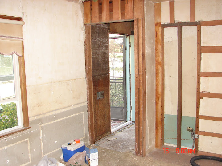
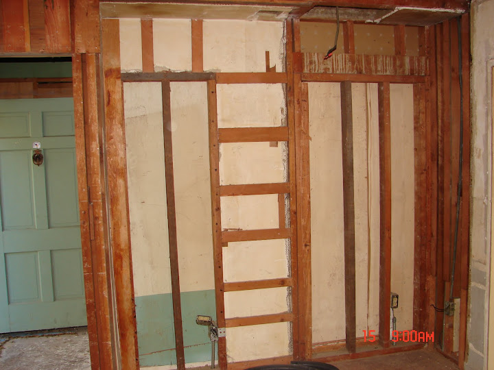
We are ready to go with the kitchen. Dad is building cabinet frames, the floor is down, I bought a 30 inch, single basin, fireclay, apron front sink! I adore it and can't wait to do dishes in it... STRIKE THAT.... can't wait to watch Bran do dishes in it... STRIKE THAT... can't wait to watch Bran put the dishes in the dishwasher from my lovely sink.

But still, I don't know what I want to do with the cabinets, backsplash, hardware, etc. Many decisions to be made, and not terribly much time to make them in. I am picky. Very picky. Since we are on a super dooper incredibly tight budget, that makes it ever more difficult. In a kitchen, I'll go for function over form. However, aesthetically, I love or am inspired by elements of these kitchens:

Love the inky blue cabinets with the farmhouse sink. These are concrete counter tops. I'm not sure I'd brave no upper cabinetry, but it does make it feel very open.

Again with blueish cabinetry. I love the pop of teal and the farm sink! The owner of this kitchen mentioned that the backsplash was not installed. They went with white subway tiles.

How gorgeous is this kitchen (esp that last shot!)? I love the copper touches. I feel like this kitchen is just begging to have a redhead cook.

These two look similar, with the mini white tiles. I tend to like the first one a little bit more, but the jury is still out on these tiles. I feel like they will really date the kitchen (what, blue cabinets won't?)

Not totally my style, but I can appreciate it's classic beauty.

I like the mix of marble and wood here with the white subway tiles.

So that's it for now. Lots to think about!

Monday, April 5, 2010

Kick off your shoes!


Our modest entry way has been begging to be made over. This little room (8ft wide and 4 feet long)has seen many transformations throughout it's nearly 100 year history. It once was a porch. Then, it was a cement slab covered by carpet with wood paneling on the walls. Now, it is a lovely slate entry way (soon to get gussied up for company).

Let me help you get situated as to the layout.


When you walk up the brick entry, do you see that teeny tiny little room? Yeah... that's the entry. Not a lot of space, but the plan above is actually the layout of how the house used to be. When you walked into the house, you had a choice to go right into the bedroom or straight into the living room. This didn't make sense to us, so we changed that 3rd bedroom into a dining room, closed up the wall to the immediate right of the entry, and made a 4 foot opening from the living room into the dining room. You have already seen some of these changes.

This is the view from the dining room, through the entry, and out the front door. This was after we took out the closet and took down the wallpaper and took off the paneling from this room. See the awkward layout?

Another view of from the dining room, showing where the closet was taken out and the opening into the entry way.

And eventually went to this...

And then into this:
Both the new and old doorway are framed in.

And then this!
And here it is wallboarded (fully painted pics are coming soon!).

Another angle from the living room into the entry before:

And After:


So not only were the walls a mess in terms of layout, they were also a mess in terms of structure. At one point, the entry was the front porch. That means the walls were made of stucco, just like the outside of the house. Well, what has the theme been throughout the other parts of the house? If the wall is messed up or just plain ugly, PANEL IT! So of course, they did these here! Once we took the panelling off the walls in the entry, we found stucco!

From the entry into the living room...

So, we did some manual labor (and by we I mean Brandon).

So now, back to the floor!

First things first... I layed out the slate on the floor in a pattern that pleased my eye. The slate that we bought has a varied sized of slate that go into a specific pattern. We bought 4 boxes of 10ft each and mixed up the stones from the boxes to get a more random and not clustered look. Since the natural slate has so much variance, I wanted to make sure that it looked abundantly random, but not too much so.
After it was all layed out, we measured out the exact dimensions of the entry and positioned it so that the most visable/ higher traffic areas got the full pieces of slate. To do this, we used chalk to outline it. We marked which pieces would need to be cut.

Then we got down to business.


The cement pad under this section of the house was not fully level, so dad created a little sub floor system and topped it with plywood. We secured cement wonderboard to the plywood so the slate had a nice rough surface to adhere to.

Dad and Brandon then got to mortaring. We put it on in sections and backbuttered (spread thinset/mortar on the back) each tile.

This is not a great picture of it because the colors don't come through like they do in person and especially in natural sunlight, but it really is a beautiful tile pattern. We realized that we will probably put on a light gray grout because there is some space between the tiles, and then we'll seal it, but for now, I absolutely love it!


PS, check out how awesome the plaster looks!